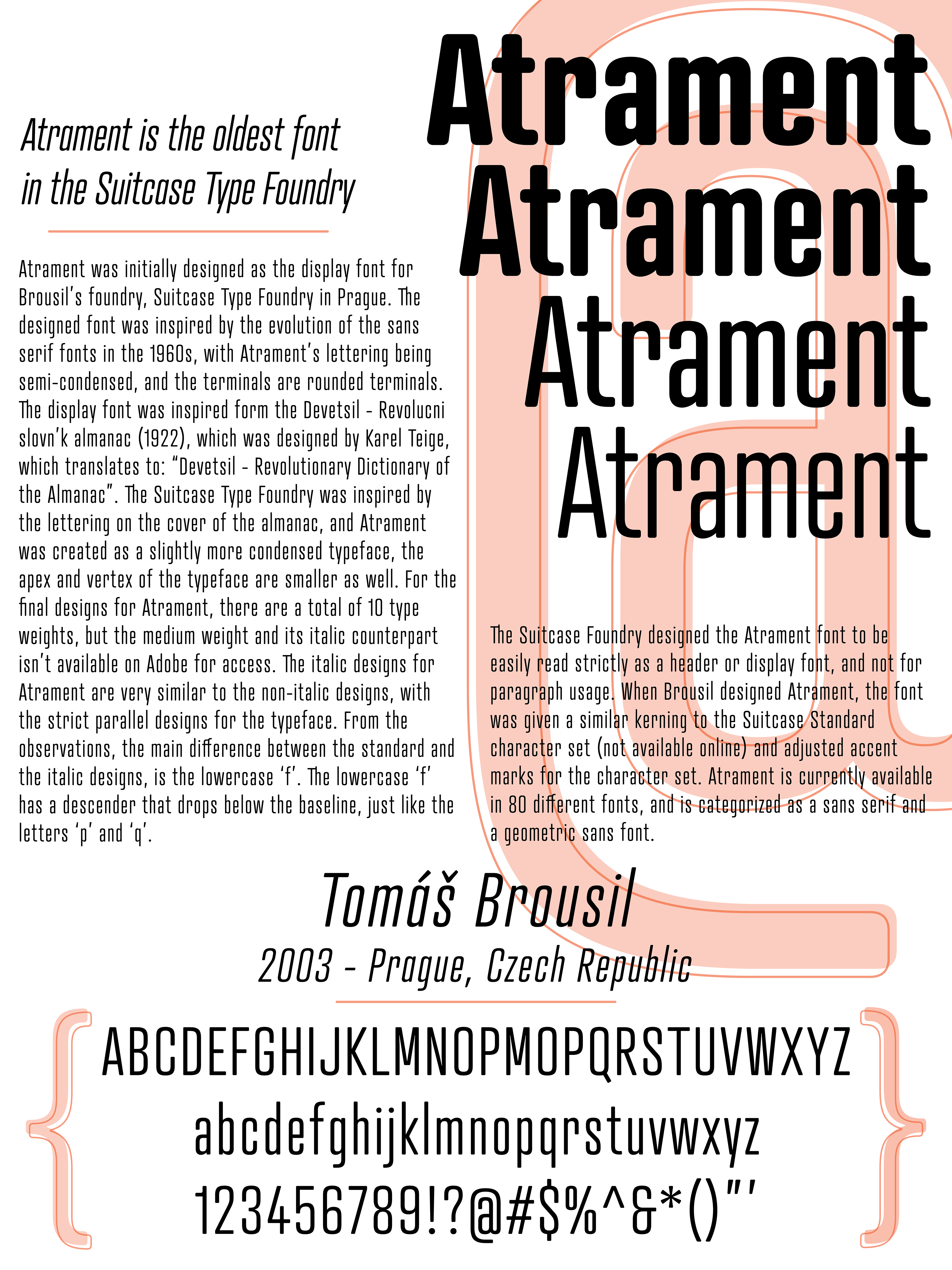
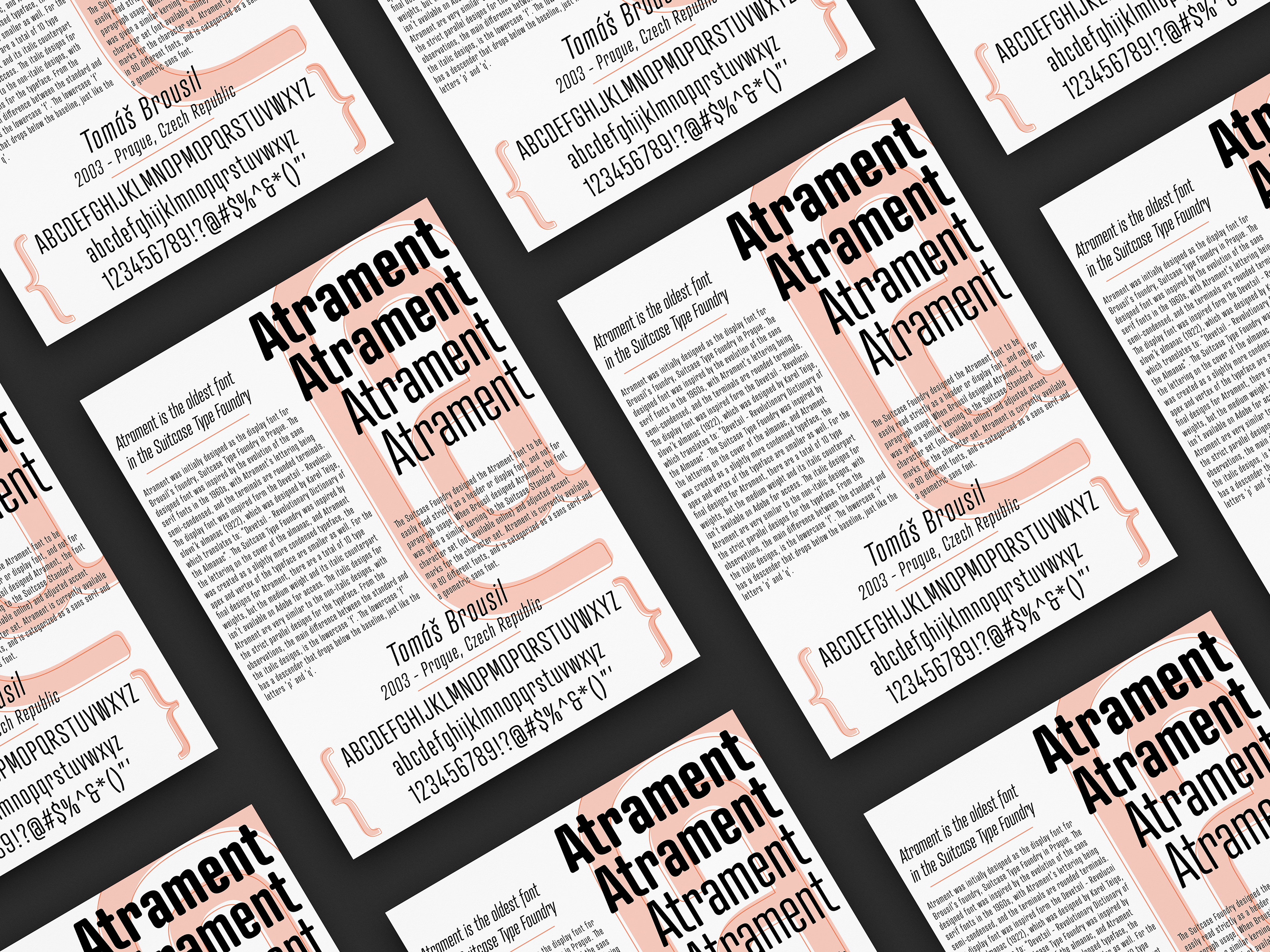
For my Typography 2 class, we had a project on a font we could research and create a poster about. I chose the font 'Atrament', because it's a simple font, but is made in a wide variety of weights and overall width of the lettering. I wanted to keep the poster simple like 'Atrament', to still have the space to show the history and show the wide variety of weights from the font.


